Fishbowl - Onboarding Process
Drives onboarding process is reliant on implementation and sales calls. This process could take up to 9 months for the customer to be fully integrated in the system. This faced scalability issues and preference for the user to have self-service options. Our team aimed to reimagine this experience, and empower the users to onboard themselves efficiently. This case study details our iterative journey, from ideation to refinement. The results are a more user-friendly onboarding interface for the Drive customer and a 5 week process to get them integrated.
Goals
Improve customer onboarding:Provide a professional and polished user interface to get new customers into the product quicker. Setting our company apart from competitors.
Create a walk through wizard that can be referred to anytime:By creating a wizard that can be referred to at any time we provide customers with a consistent experience that helps retention.
Sign Up | Login
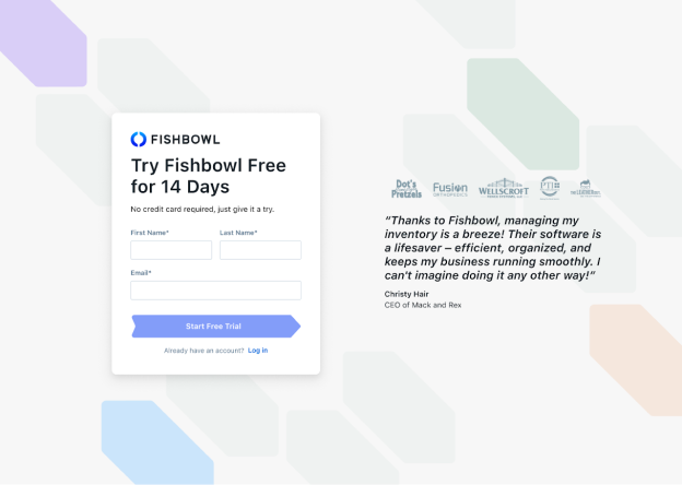
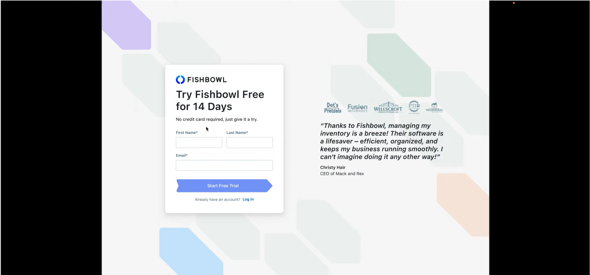
We started with a new Sign Up | Login page based on the new martketing style guide.
Getting Started Home Screen

After interviewing customers we learned that they needed a Implementation Home Page. The implementation process would be easily tracked and would let the user know what will be next. This feature gave a game like experience to the user with a feeling of accomplishment at each step being completed.
Wizard | Setup Assistant
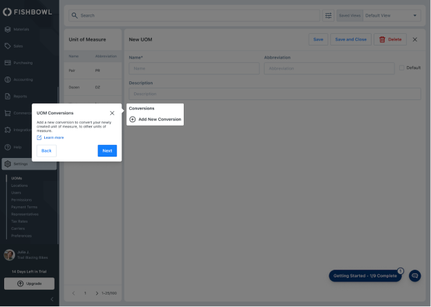
A Wizard | Setup Assistant was created to help the users identify the features along with a link to technical documents that give more details of what is required. This feature helped in reducing implementation time and additional support calls.
Pop Up Progress Report

After more research with customers we determind that it would be helpful to have a Collapsable Pop Over that shows the progress for getting implementated with a link to the next steps for success.
Messaging with Implementation Team

Creating a Direct Messaging board for the customer to chat to a live implementation specialist cut down on call time and response time.
Sample Database for Customer Learning

A Sample Database was created for users for testing the software during the implementation period.
Ready to Go Live

When the customer is done with the implementation process we congratulate them and help them "Go Live" with getting the accounting set up.
Research
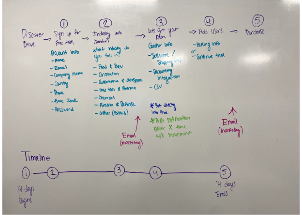
The team has a membership to the Interaction Design Foundation learning courses. The team attending a master class titled "How To Attract Users Through Great Onboarding Experiences" by Wes Bush. He stressed the importance of grabbing users' attention fast to keep them hooked, suggesting we hold off on asking for payment until after they've had a chance to try things for free. Additionally, Bush shared a case where revenue increased by 20% following the removal of email confirmation during account creation, emphasizing the value of getting a user into your product quickly before losing their attention. He also explained how a 14-day trial period is the optimal balance. We tested this process with customers and found a positive response. The 14-day trail allowed our customers to utilize our sample database and have time to use and experience the software.
Flow Chart
Translating what we learned from Wes and working with our implementation and sales teams we created a blueprint of the customer work flow for onboarding. Constructing a flow chart outlining the 14-day trial process.

Prototyping / User Testing
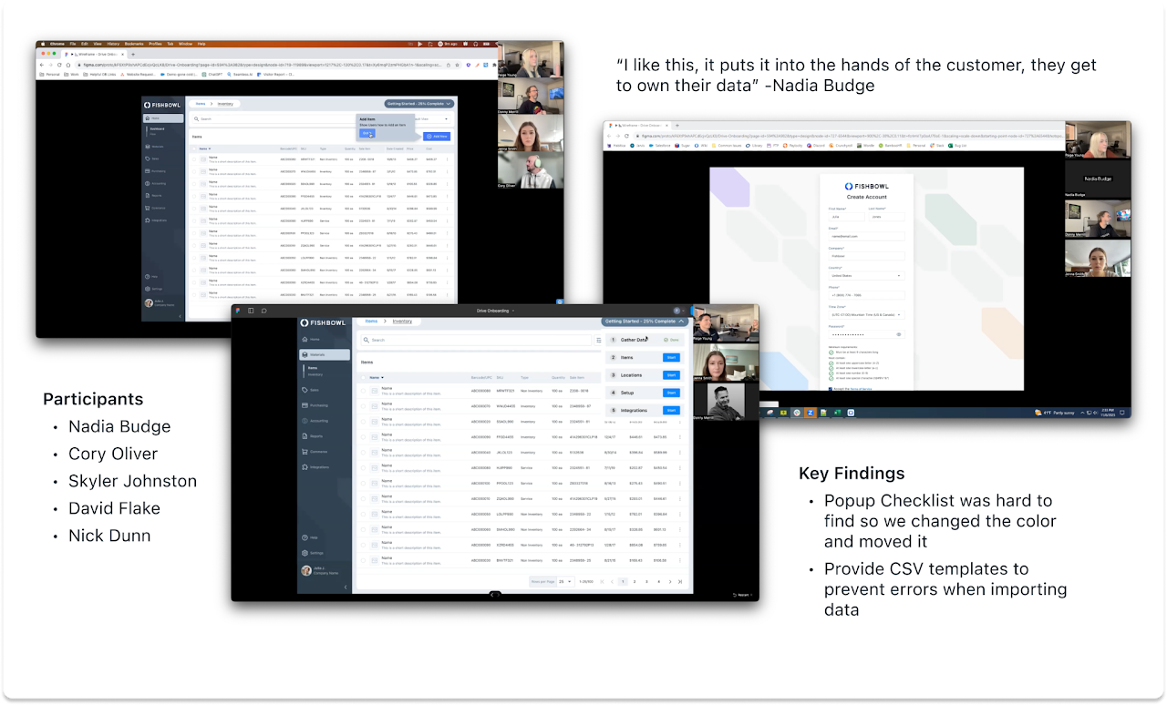
Through Figma wireframes and prototypes, we facilitated user testing with colleagues at Fishbowl and using our customers from the Fishbowl Labs program. While the overall reaction was positive, identified areas for improvement included enhancing the visibility of the popup checklist and providing CSV templates to decrease errors during data imports.
Iteration
There was a lot of iteration and pivoting throughout this project. Continuous refinement guided our process, evolving the onboarding steps and import processes toward a clearer understanding of Going Live. Iteration is essential to the design process, it's about staying flexible and striving to improve until we create the best possible experience.
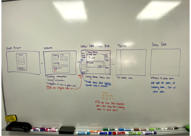
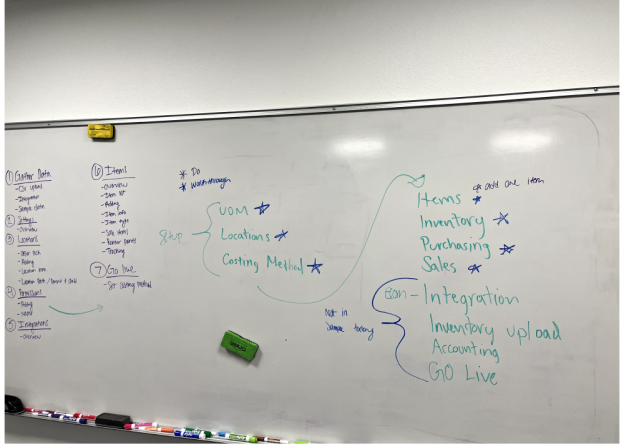

I had one of the team put together a video for user the onboarding demo. This was referenced by the devs when needed.
Conclusion
We've learned a lot about the importance of smooth onboarding experiences. We took away valuable lessons in iterative design and the constant quest for better user experiences. Moving forward, the team is excited to apply these insights to future projects, always striving to create more intuitive digital experiences.
