Legrand - Equinox
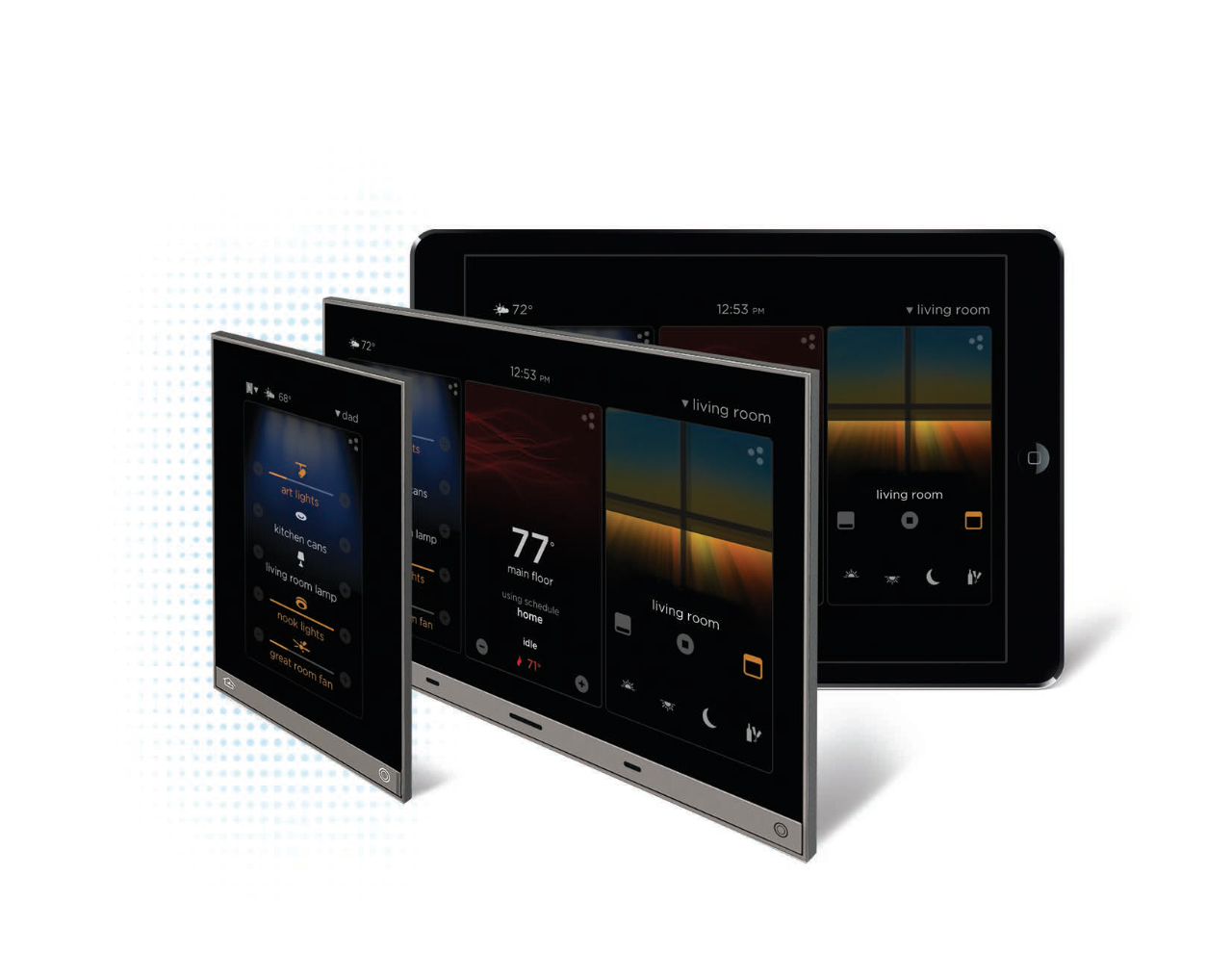
Equinox needs to work on iOS, Android, and the in wall controller. It needs to be Simple - Intuitive access, control, and feedback for luxury spaces. Flexible - Easily personalized and adapted to the customers' changing needs. Reliable - Simple powered network connection (Cat5e with POE); iOS and Android tablet apps provide wireless system control. Consistent - Keypad, touchscreens, and mobile apps provide a consistent graphical user interface; aesthetics such as form, color, shape, and size are complementary. Multi System Control - Comprehensive drivers allow interoperability with premier partners (for example, shades from Qmotion).
Goals
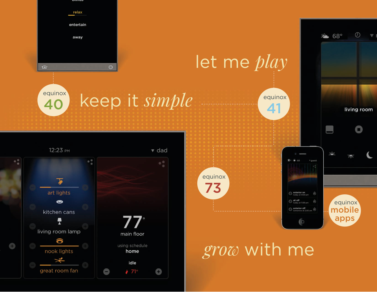
Keep it simple: I need it to be easy to control of my lighting.
Let me play: I would like to customize the features of my system.
Grow with me: Let me add devices with ease and not have to call an installer.
Define the Levels
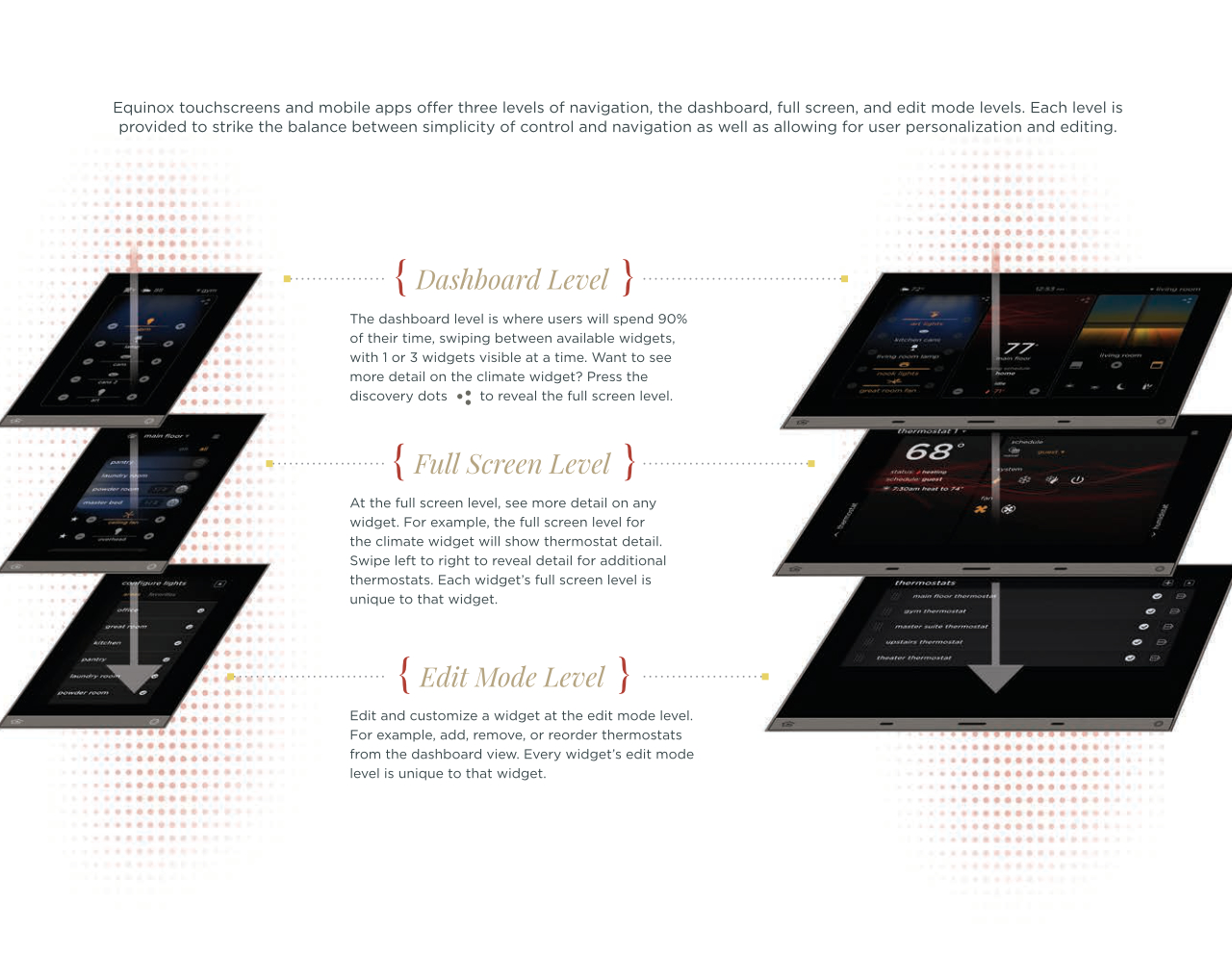
The Equinox 41 and 73 apps provide levels for user interaction and modification. Based on our research we needed three levels of control. This helps keep the balance between simplicity and ultimate customization. The Dashboard (first level, Keep it simple) provides the simple interface for 90% of what the user wants to know and do. The Full Screen (second level, Let me play), this level gives more detail and controls to the widget. The Edit (third level, Grow with me), this is where you can personalize schedules, lighting scenes, the dashboard, rename lighting, and even assign a set (profile) of widgets for guests or family visitors to limit access to the whole system.
Defining the Widget
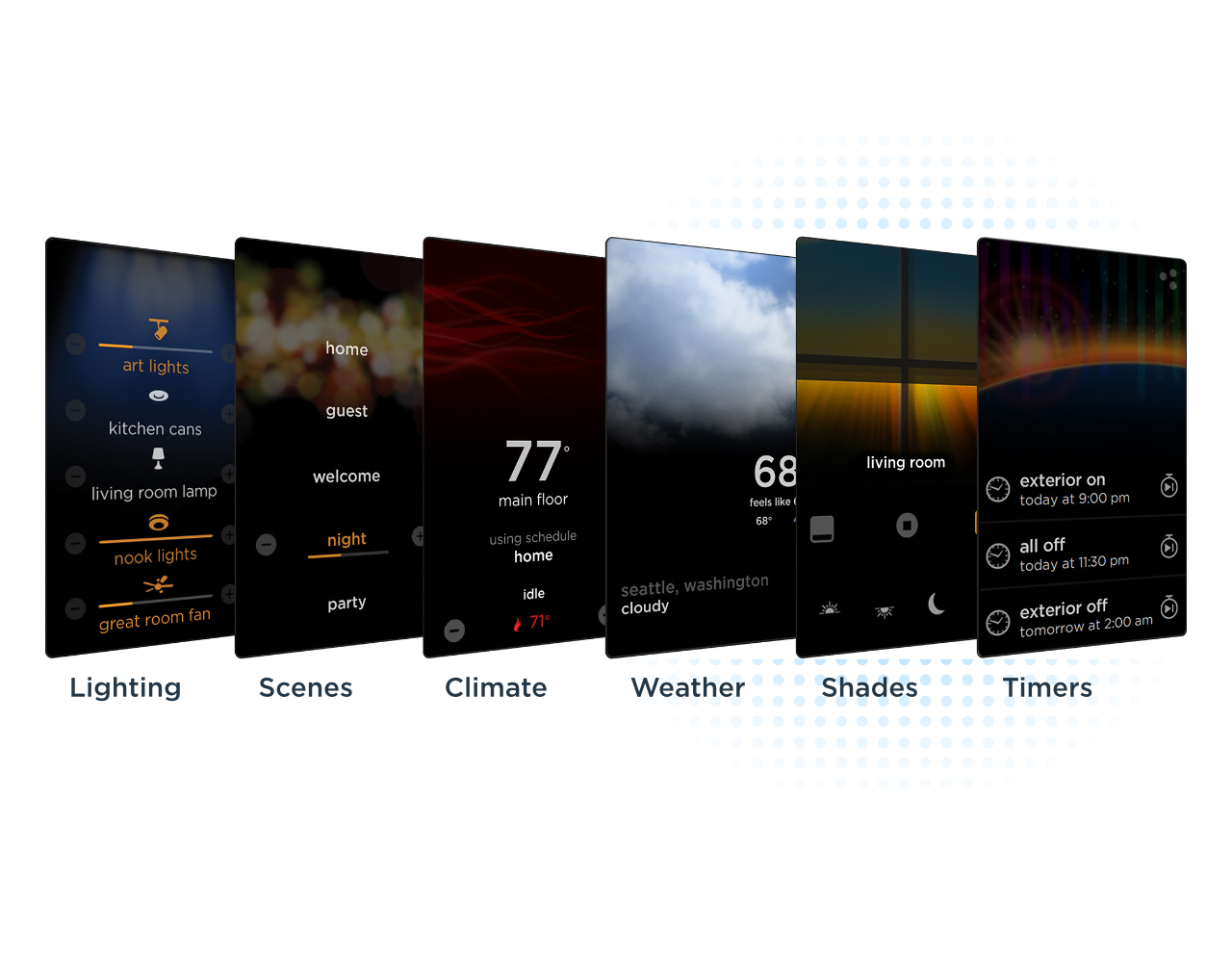
A widget is the software application embedded in the Equinox device that controls and communicates with the equipment associated with that widget; for example, a lighting widget for your lighting system. Widgets allow intuitive system navigation and control by users. They also provide the power for personalization, allowing users to adapt the system to their changing living environment. Equinox widgets are the very efficient means that allow integrators to program intuitive control for complex requirements. The widgets on the dashboard are: Lighting, Scenes, Climate, Weather, Shades, and Timers.
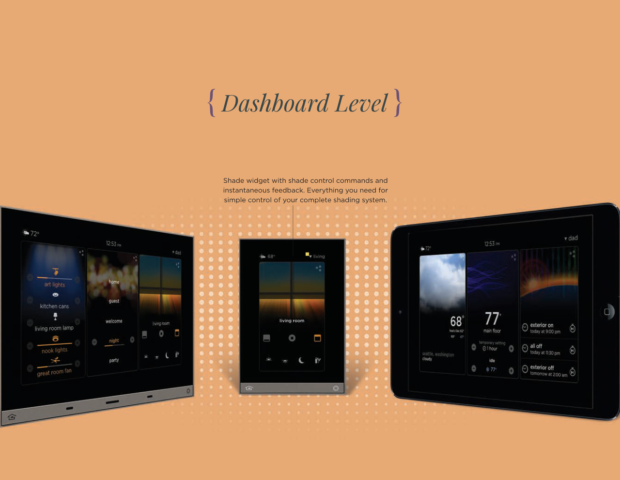
Dashboard
This is the snapshot view of each widget. Our research showed that users wanted control of at least 5 favorites at this level. The dashboard is where 90% of the users time is spent, this is because of quick usability. To browse the widgets, users can swipe left or right to reveal more widgets. After initial setup, users can select which widgets to display and re-arrange them per persona. The dashboard has live feedback from what is happening in the home. For example, with the HVAC system the user can know at a glance what the system is doing and control the system from the dashboard.
Full Screen
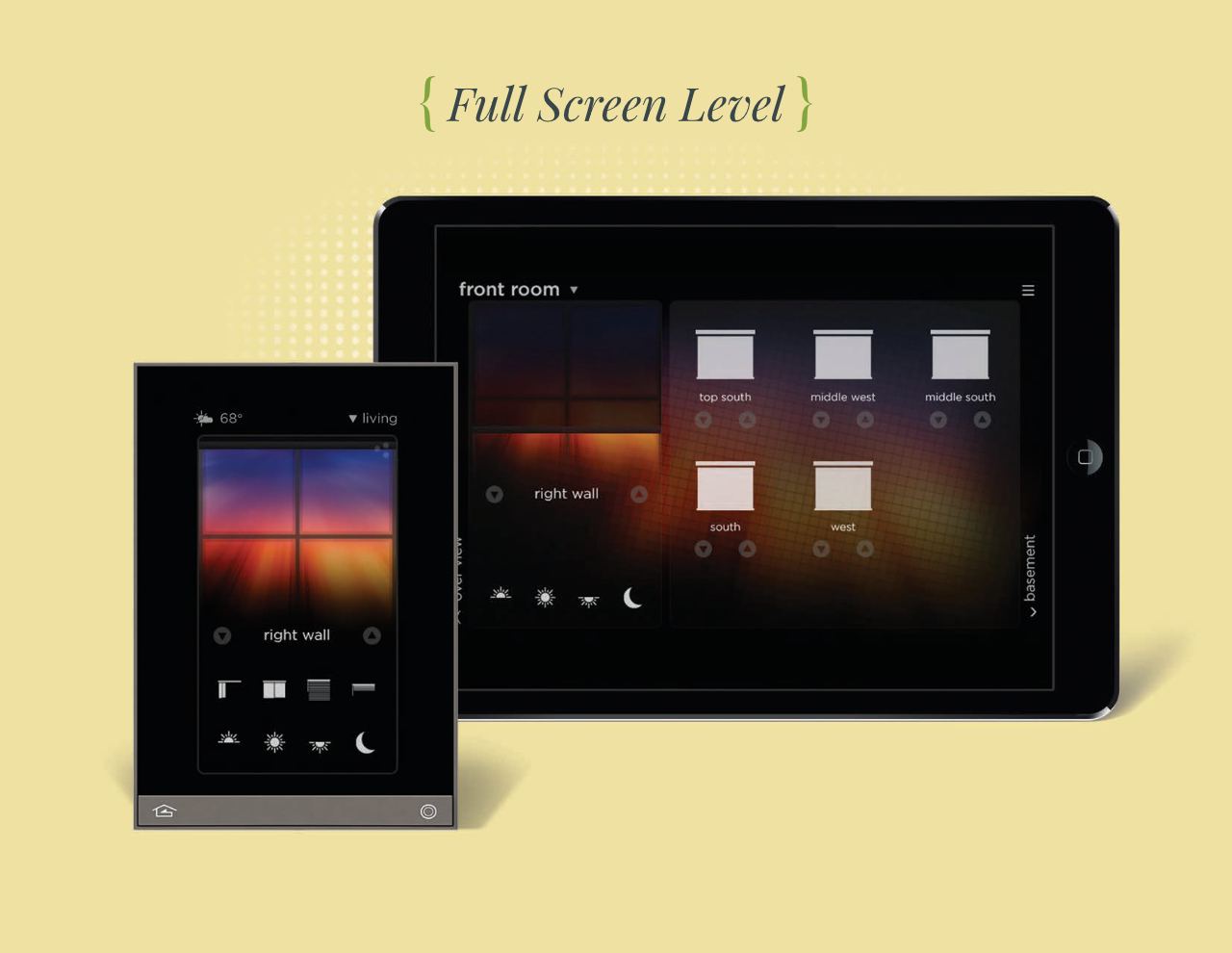
Touching the top right 3 dots will open the full screen level. While the dashboard provides users with quick access to all the widgets; the full screen view allows access to more widget detail. While the tablet app and 73 device utilizes the full screen with more information, the phone app and 41 device provide a condensed view of the widget detail. Users can browse more rooms by swiping left or right. An example of why you would want to go in full screen; In shades you can swipe between multiple rooms to control each shade individually or together.
Edit Mode
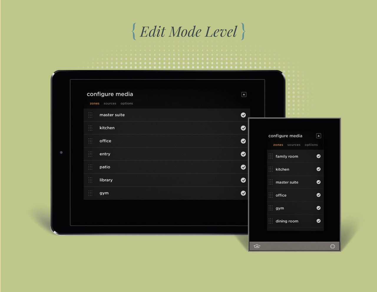
From our research this is for the power users that want to be able to grow the system. This level allows the user to customize individual widgets. For example, customize the thermostat schedules, add more cities in the weather app, select favorites to show on the home screen in lighting and shades. Create users and limit their access. This feature posed a challenge for both the larger tablet screens and the smaller phone screens. With the tablet the user has full access to everything, on the phone we opted to only give controls that are compatible with the smaller screen size.
Conclusion
During the research of this project we learned that our users wanted more control over their home systems but were afraid of the programming aspect. Our older system had to have a costly technician come to re-program the home lighting and other controls. Initially we found that 70% of homeowners were afraid to adjust the system and were willing to pay for a technician, the other 30% learned to use the programing software, but would only make small changes in fear of breaking the system. After working with the homeowners and learning what they wanted to control, we came to the understanding we needed something better. This lead us to create the Equinox system. During our research and showing customers prototype wireframes we found that 90% of customers felt more comfortable with the customization of the home automation. This was a good excercise in learning the difference in the customer needs and wants.