Fishbowl - User Interface
Goals
Improve customer acquisition and retention: Provide a professional and polished user interface to attract new customers and retain existing ones, setting our company apart from competitors.
Achieve brand unity: By using a cohesive design language across all platforms, we establish brand recognition and provide customers with a consistent experience that reinforces our brand values.
Achieve Consistency Across Devices: By using a cohesive design language across all platforms, we establish brand recognition and provide customers with a consistent experience that reinforces our brand values.
Marketing Inspiration
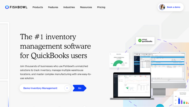
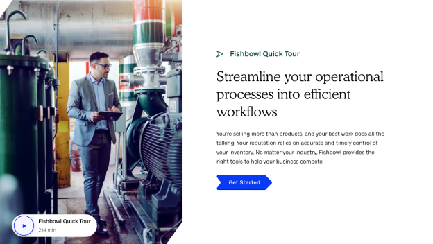
As I prepared the UX team to revamp the product style, we worked with the new marketing style guidelines. Drawing from their work, we unified our product design to create a seamless experience, improving the customer journey.

Crafting the Style
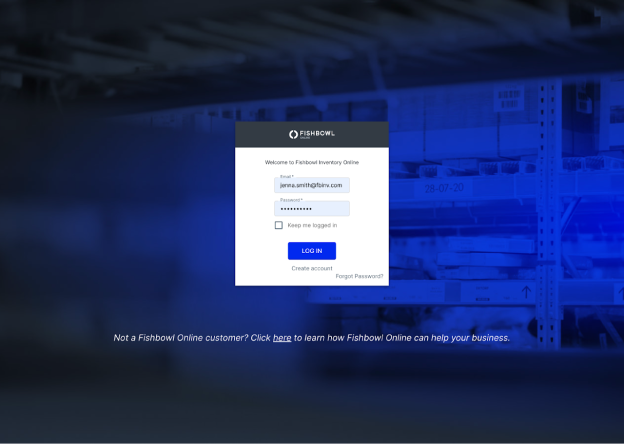
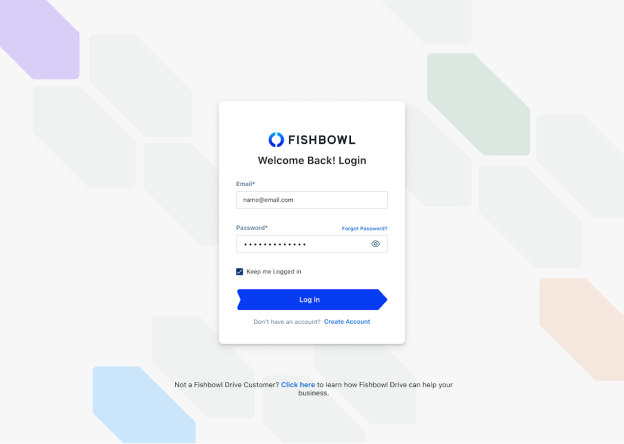
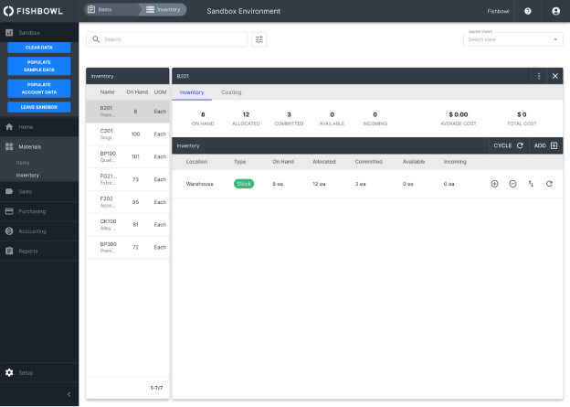
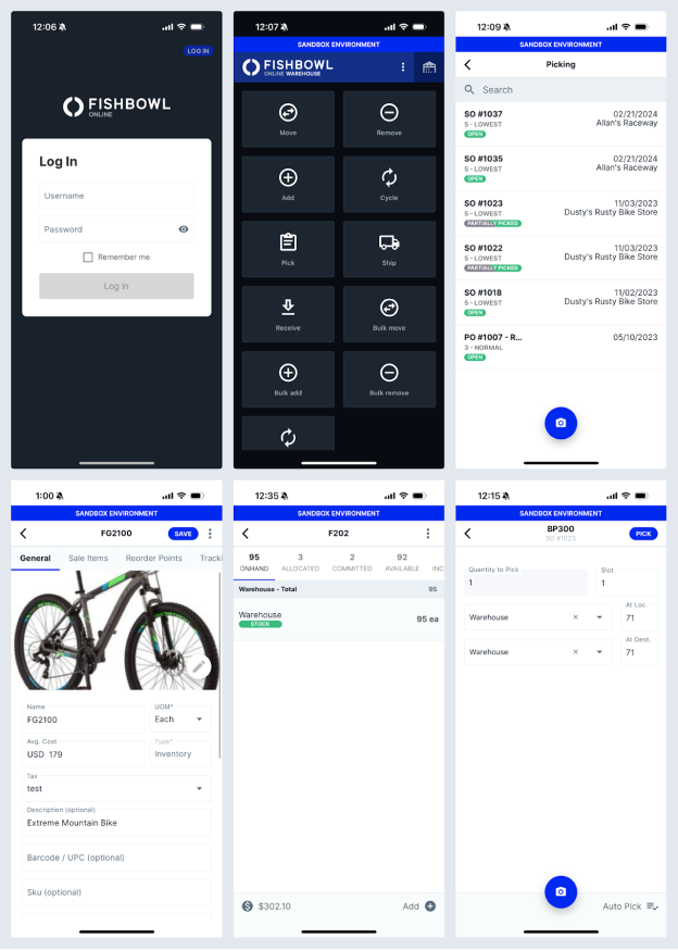
The marketing style guide didn't have everything we needed for the software. I had my team explore various design trends in applications, along with brainstorming sessions to create a mood board. We wanted our design to have a modern and trustworthy aesthetic. To get this, we opted for a rounded-corner, card-like appearance, emphasizing ample white space and removing dark title headers.
Mood Board
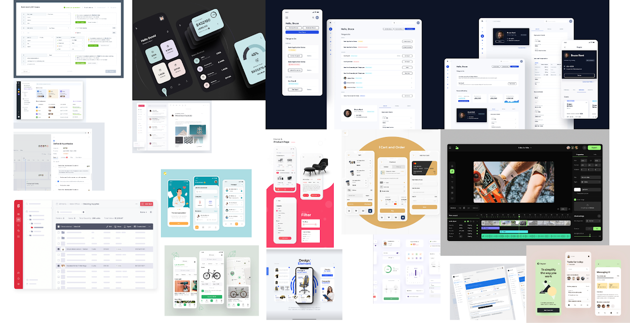
Taking inspiration from our mood board, we began styling wireframes for another project. This iterative process involved team discussions to refine our preferences. The team gradually established our style and created versatile Figma components for buttons, colors, form fields, and more. This style library simplified the creation of new mockups and ensured consistency across designs.

Iconography
During this process we found there were inconsistencies in iconography between the desktop and mobile apps. Icons varied in style, from filled to outlined, and differed in stroke thickness and level of detail. To address this issue, we team created a cohesive set of icons with consistent styles, stroke thickness, and rounded corners. By standardizing our iconography, we enhanced visual coherence across Fishbowl's products, aligning with our overarching goal of improving brand unity and recognition.
Status Colors
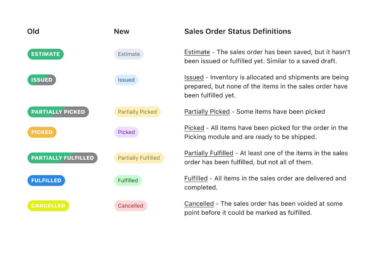
Fishbowl Drive is an inventory management software featuring status tags that track orders from estimate to fulfillment or cancellation. The old status tag colors had many inconsistencies and confusing choices, such as using neon green for canceled orders and green for initial steps. In our redesign, we opted for a clearer approach: red for canceled orders and green for completed steps. Additionally, we ensured that all tag colors met ADA color contrast standards by introducing new, compliant color schemes. These changes not only improved visual consistency but also enhanced accessibility.
Themes
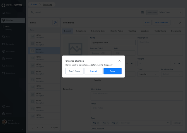
Initially, our designs lacked a dark mode, with our color palette limited to vague shades of gray or blue. To address this, we worked to created a clear color scheme, assigning each hue a distinct purpose to ensure a seamless transition into dark mode. This not only enhanced our design but also established clear rules and definitions, promoting consistency and standards.
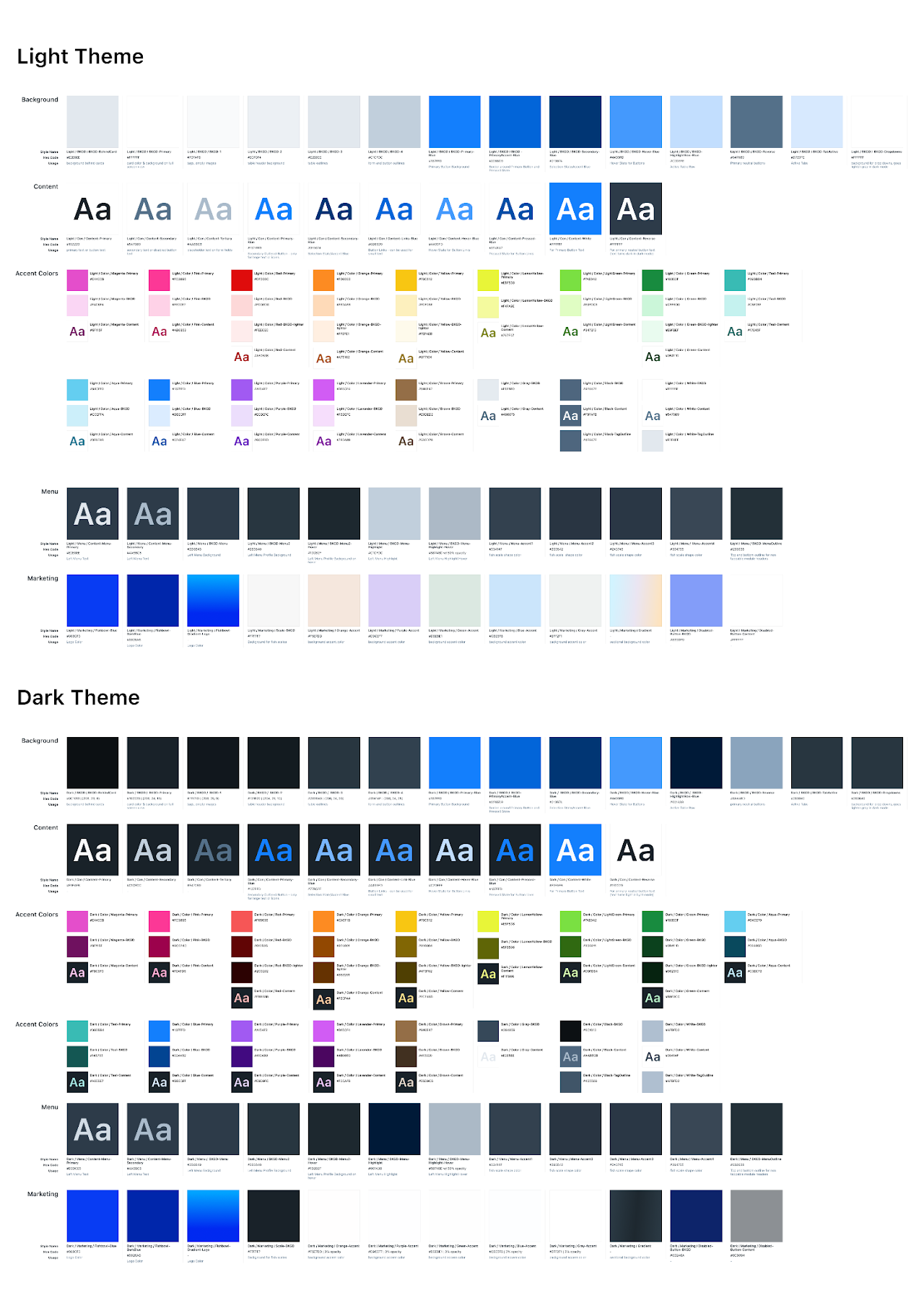
We created a dark mode by adapting existing mockups to darker shades and gathering feedback from internal stakeholders and customers. Then, we meticulously assigned content and background colors with a 1-to-1 match in each mode. At this time, there were no Figma variables, so we utilized a plugin to swap themes. This process saved time by eliminating the need for manual color adjustments, ensuring a smooth transition between light and dark modes with just a click.

Feedback and Testing
I created a program that we called Fishbowl Labs. This is a group that would vary between 15-20 customers that are willing to work with the product team to test new ideas and advise in what new features would be useful for the software. The product team would work with these customers throughout the process from wireframes to high fidelity prototypes. Along with Fishbowl Labs we received feedback from various stakeholders in the business. Particularly, the Sales team expressed great enthusiasm for the redesign, noting its modern appearance and its contribution to the product's consistency and alignment with marketing materials. They expressed confidence that this new UI would be easier to sell. Additionally, the Engineering and QA departments provided valuable input. Given their daily engagement with backend components, they welcomed the opportunity to review and enhance the product.
Engineering Handoff
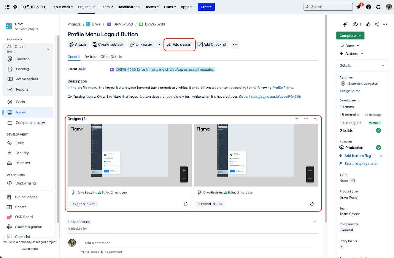
We worked closely with the development teams. This gave us the opportunity to gain invaluable insights about how to make the developers processes easier. We would show the dev teams how to navigate our Figma files in live calls and made short video tutorials they could refer to. These tutorials covered the basics of Figma navigation and our style library, which held all the main components for our redesigned screens. This ensured clear visual representation for easy implementation. To address any challenges, we set up a Slack channel with the dev leads and the ux team for questions. The introduction of Figma's dev mode during the project and its later integration with JIRA improved our workflow.
How to use Figma for the dev teams
Example of the Figma integration
Old Style
New Style



Learnings
From this experience, we learned how to better document design decisions for the future. While components were well-organized, there were instances where clearer guidelines could have been provided. For example, although all our screens followed a lowercase lettering style, a developer overlooked this detail, highlighting the need for more communication of design rules. Also, we saw the importance of making feedback between designers and developers quicker to solve issues faster. And understanding the developer's workflow better made us more empathetic to their challenges, pushing me to find ways for my team to collaborate better together in future projects.
Conclusion
Helping my team to get a new design out and see it published is very fulfilling. Moving forward, with the software now with the components for the developers, iterating and refining the design system will be more streamlined and efficient. I am confident that our cohesive style guide will not only resonate with customers but also elevate Fishbowl's brand image to new heights.
